

On this page
TL;DR
I’m Kristian. I led the strategy and the design for Younger Me MD’s new website, eSEO Space did the development, and the site launched around Oct 2024. The old homepage opened on a video with a “Click here to get started!” button, and its Services menu listed Peptide Therapy after Rapamycin, Low Dose Naltrexone, and Cardio Res-Q. I gave the practice a green and white design that reads clinical, rebuilt the navigation around patient goals, and designed mobile-first because the old site broke on phones. The practice told me, “We’ve never seen anything so on-point for our industry.”
The practice and the problem
Younger Me MD is a medical practice in Conshohocken, PA. Its homepage puts peptide therapy, hormone optimization, and longevity medicine at the center of what it does, lists a board certification in “Anti-aging, Regenerative and Functional Medicine,” and its peptide menu even lists “Regenerative Blends.”
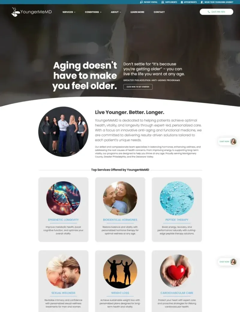
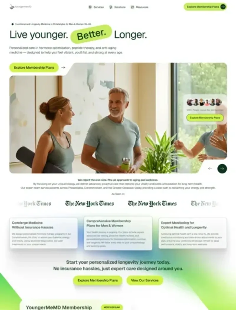
The old site broke on mobile. A clinic that offers hormone and peptide care has to look like a medical practice, and the new design needed to say that the moment someone landed. The old homepage didn’t do that. Instead it opened on a video under the heading “Greater Philadelphia Anti-Aging Programs,” with a “Click here to get started!” button that never said what you were starting. The practice’s own line, “Live Younger. Better. Longer.,” sat below the hero as a section heading. The screenshots on this page show both homepages.
Who did what
I built this with eSEO Space, the San Diego development team I partner with. I owned the strategy and the design, and they built the site. When I say “we” on this page, I mean the two teams together.
Three design decisions, and why I made them
A green and white palette that reads clinical
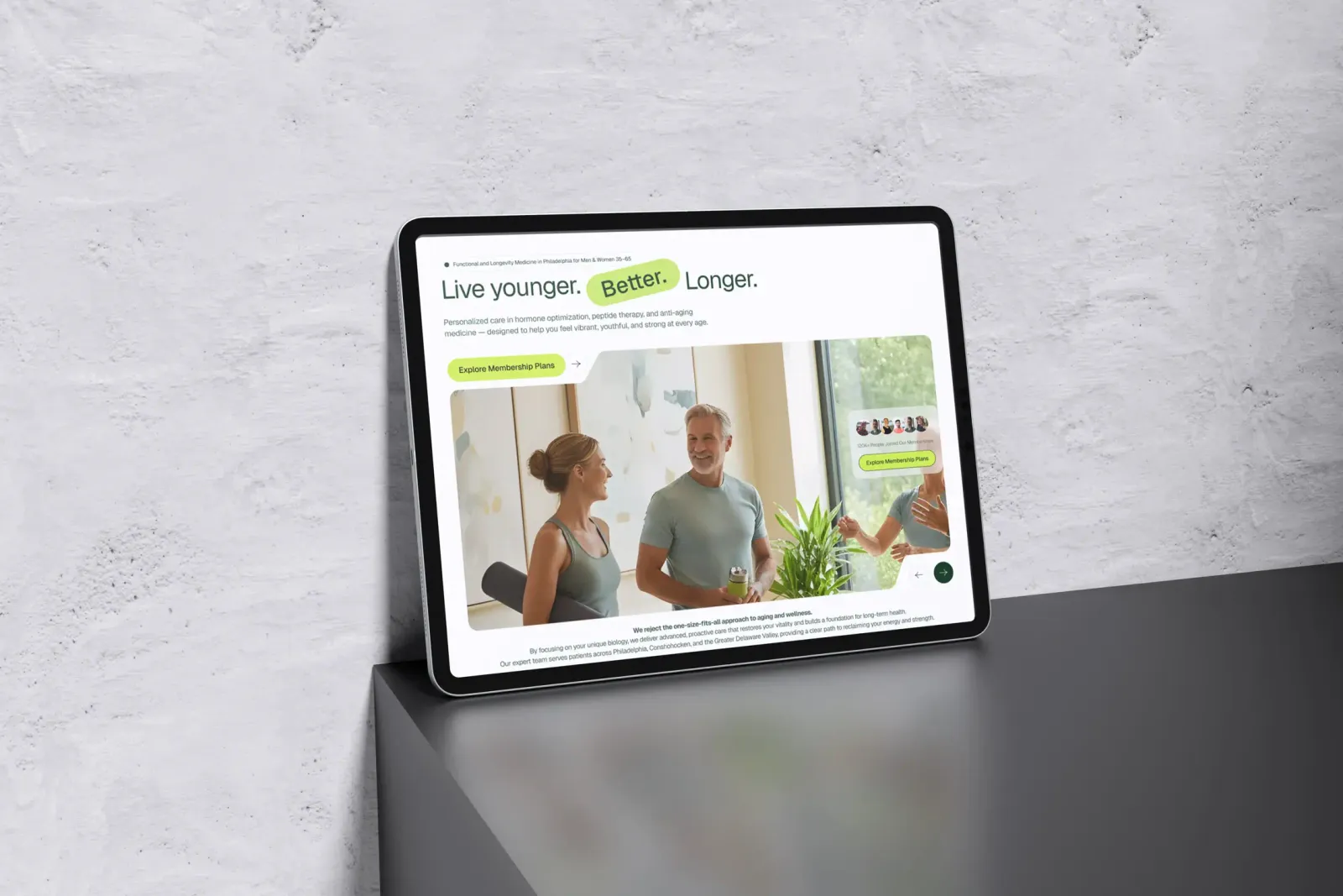
I chose a green and white palette for a clinical, premium look instead of a wellness influencer look. The palette is deep greens with pops of lime, and plenty of white space. The photos show real people feeling better instead of stock models in lab coats, and the hero opens on a couple in a wellness setting.
“Live younger. Better. Longer.” moved up from that mid-page heading into the hero, next to a membership plan button that replaced the vague “get started” link. Someone deciding who will manage their hormones is choosing a medical provider, and the site should look like one.
Treatments organized around what a visitor came for
The old navigation made visitors work for it. “Semaglutide Injections” sat under both Weight Loss and Peptide Therapy in the Services menu, and a second menu listed conditions alphabetically from “Adrenal Fatigue” to “Weight Loss Resistance.” On the homepage, the same care showed up twice under different names: once as top services like “Weight Loss,” then again as membership plans like the “SlimmerMeMD Plan.”
I reorganized the service structure and navigation so visitors find the treatment they need. The homepage answers “What do you do, and is it for me?” first, then offers clear paths by goal: hormone therapy, peptide protocols, regenerative treatments, and weight management. Each service page explains what the treatment is, who it’s for, and what results look like.
Mobile-first, because the old site broke on phones
On a phone, the old site was hard to use: forms didn’t work properly and images didn’t scale. For a practice whose next step is a consultation request, a form that fails on a phone is where the visit ends.
I designed each section for a phone screen first, then expanded it for desktop. Forms are simple, and the buttons are sized for a thumb.
Where the practice is now
I checked youngermemd.com in Semrush’s US database. These are estimates from its monthly history, not the practice’s own analytics.
In October 2024, the launch month, Semrush shows 30 organic keywords, 2 in positions 1 to 3, and estimated organic traffic of about 51 visits a month. The count stayed between 30 and 129 keywords for more than a year, then climbed from January 2026: 264 keywords that month, 574 in February, and 966 in March. By September 2026, it counted 1,133 organic keywords, 37 of them in positions 1 to 3, and estimated organic traffic of about 1,219 visits a month.
That climb began more than a year after launch, after my part ended, so it’s the practice’s current state and not credited to my work.
What I’d do differently on the next project
Here’s what I would do differently on the next project like this.
Set up tracking at kickoff. I’d ask for Analytics and Search Console access at the start of the project, so the effect of the redesign is measured from day one.
Stay on for SEO after launch. That way, gains are measured and credited to whoever earned them.
Capture before screenshots. I’d document the old site properly before replacing it, so the before and after are easy to compare.
What this project shows about regenerative medicine web design
A regenerative, peptide, or hormone clinic has to look clinical and also fit a long list of treatments, plans, and conditions into one menu. Here that meant a clinical palette, paths by patient goal, and a layout built for the phone first, and that’s where I’d start with yours.
If that’s the problem you have, look at how I approach healthcare website design or a website redesign. You can also see my general web design work and other healthcare projects. Or tell me what your site looks like today and I’ll tell you straight whether a redesign is what you need.
Questions About This Project
No. My part was strategy and design, eSEO Space handled development, and my work ended after launch. That's why the Semrush growth on this page isn't credited to me.
Design and strategy were mine. Development was eSEO Space's.
It changed how the site looks, how a visitor finds a treatment, and how it works on a phone. I walk through each change above, with the old site next to the new.
It has evolved since launch. The hero I designed puts "Live younger. Better. Longer." up front. Today the homepage opens with "You've optimized your life. Now optimize your biology."
Measure from day one, stay on after launch, and screenshot the old site before replacing it.
In collaboration with
eSEO Space
Development
Strategy and design by Kristian (DMS), development by eSEO Space.
Learn more about our partnership
Case study by
Kristian Kreaktive
Founder & Lead Strategist at KREAKTIVE
#1 Freelance Digital Strategy Expert on Clutch (Oct 2026). 17 years in digital marketing, 15 of them running his own agency, building websites and SEO strategies that bring real results for small businesses.
Related Case Studies

Website Redesign for a 30-Year AV Production Company in Orlando
455 organic keywords ranking with #1 positions and AI search visibility across 4 platforms
Built with eSEO Space

Website Redesign for an HVAC-R Nanotechnology Company in Houston
Full website redesign with industry-specific landing pages for a global HVAC-R nanotechnology company
Built with eSEO Space
Safari AI: Designing clarity for a vision AI platform serving 7-Eleven and theme parks
53 organic keywords with #1 positions for core brand terms and enterprise case study pages
Built with eSEO Space