


Conversion-Focused Web Design: How to Build Pages That Turn Visitors Into Customers
By Kristian Kreaktive Last updated
Conversion-focused web design builds every page around one action, like a call or quote request. My 5-step framework, plus a teardown of my own homepage.
TL;DR Too Long; Didn't Read
Conversion-focused web design means every page has one job (a call, a booking, a quote request) and everything on the page either supports that job or gets cut. Win the first 10 seconds with a clear headline and button, follow a problem-to-proof page flow, keep forms short, and put real reviews and photos right next to the decision.
On this page
Conversion-focused web design means building every page around one action you want a visitor to take (call you, book a time, request a quote) and removing everything that gets in the way of that action. It’s not a color scheme or a bigger button. It’s a way of deciding what goes on the page, in what order, and why.
If you’re asking “why is my website not converting?”, this is usually the answer: the site was designed to look good, not to get someone to pick up the phone. I’ve worked in digital marketing for 17 years, 15 of them running my own agency, and I’ve rebuilt a lot of small business websites. The pattern is almost always the same. Nice photos, a vague headline, a contact form buried at the bottom, and no reason to trust the business before scrolling three screens.
This guide walks through the five-step framework I use on every build, then tears down my own homepage section by section so you can see the framework applied to a real page.
What conversion-focused web design actually means
Most people hear “conversion” and think of tricks: countdown timers, pop-ups, red buttons. That’s not it.
A conversion is just the action that turns a visitor into a lead. For a roofer, it’s a quote request. For a dentist, it’s a booked appointment. For a consultant, it’s a scheduled call. Conversion-focused design starts with that action and works backward.
Good design that doesn’t convert is bad design
I’ll say it plainly: a beautiful website that doesn’t produce calls is a failed website. It might win compliments from your friends. It won’t pay for itself.
The opposite is also true. An ugly site that converts is leaving money on the table, because trust is part of conversion. Many visitors judge your business by your website before they read much of it. The goal is a site that looks professional and moves people toward one clear next step.
Conversion-focused design vs. CRO
You’ll also see the term conversion rate optimization (CRO). The two overlap, but they’re not the same thing.
CRO usually means testing changes on a site that already exists: try a new headline, measure, keep the winner. It works best when you have enough traffic to run real tests. Conversion-focused design is the work you do before launch, so the page is built right from the start. Many small businesses don’t have the traffic for meaningful A/B tests, which is exactly why getting the structure right on day one matters so much.
Why your website isn’t converting (the usual suspects)
When a business owner tells me their site gets traffic but no calls, I check five things first. One of them is almost always the culprit.
The page has no clear job. It tries to sell every service, tell the company history, and collect newsletter signups at the same time. Visitors don’t know what you want them to do, so they do nothing.
The top of the page says nothing. “Welcome to Smith Construction” doesn’t tell anyone what you do, who you do it for, or why they should pick you.
The form asks for too much. Eleven fields, a required “How did you hear about us?”, and a CAPTCHA. Every extra question is another reason to quit.
There’s no proof where it’s needed. Reviews live on a separate testimonials page nobody visits, and the photos are stock images of people in hard hats who don’t work there.
Speed is the fifth suspect, and it’s a quiet killer. Google’s research found that as page load time goes from 1 second to 3 seconds, the probability of a visitor bouncing increases 32% (Think with Google). If your site is slow on a phone, nothing else in this guide matters yet. My mobile SEO checklist covers how to fix that.
Step 1: give every page one job
Before I design anything, I write one sentence for each page: “The job of this page is to get [this visitor] to [do this one thing].”
- Homepage: get a local homeowner to request a quote
- Service page: get someone comparing contractors to call
- About page: get a skeptical visitor to trust you enough to go back and call
- Blog post: get a reader to see you as the expert, then visit a service page
Everything on the page either supports that job or gets cut. That includes the slider your nephew built, the mission statement nobody reads, and the third “Learn More” button that goes nowhere useful.
This one step fixes more websites than any design trick. When a page has one job, every other decision gets easier.
Step 2: win the first 10 seconds
People decide fast. Nielsen Norman Group found that users often leave web pages in 10 to 20 seconds, and that pages need to communicate their value clearly within about 10 seconds to earn more attention (NN/g).
That’s why the top of the page carries so much weight. In NN/g’s eyetracking research, people spent 57% of their page-viewing time above the fold and 74% in the first two screenfuls (NN/g). People do scroll. They just give the top of the page most of their attention.
Answer three questions before anyone scrolls
Your hero section (the first screen) needs to answer:
- What do you do? In plain words. “Epoxy garage floors” beats “Premium surface solutions.”
- Who is it for? A city, an industry, or a type of customer.
- Why you? A guarantee, a result, a review score, years in business. Something specific.
If a stranger can’t answer all three in five seconds, rewrite the headline before you touch anything else.
Make the main button obvious and specific
Your primary call to action needs to stand out from everything around it, and it needs to say what happens next. “Submit” and “Learn More” are vague. “Get Your Free Quote” or “Call for a Same-Day Estimate” tells the visitor exactly what they’re signing up for.
Respect how people scan
NN/g’s eyetracking work shows people often scan text in an F-shaped pattern: across the top, across a little lower, then down the left side (NN/g). Their point isn’t that you should design for the F. It’s that scanners skip whatever isn’t up front. Put your most important words at the start of headlines and paragraphs, where scanning eyes actually land.
Step 3: build the page flow that leads to the call
Not everyone is ready to call from the first screen. The rest of the page is there for the people who need more convincing. I build most service pages in this order:
- The problem. Name the frustration your customer has, in their words.
- What it’s costing them. Lost jobs, wasted ad money, a calendar with gaps.
- What you do about it. Your service, explained simply.
- Proof. Reviews, project photos, results with numbers.
- The next step. One clear call to action, plus a way to handle the last objection.
This is the classic problem, agitation, solution structure, with proof added before the ask. The order matters because each section answers the question the visitor has at that moment.
Repeat the call to action, don’t hide it
Someone who wasn’t ready at the top might be ready after reading three reviews. Give them a way to act right there. I place a call to action after the hero, after the proof section, and at the bottom of the page. A sticky header with a phone or text button covers everything in between.
Answer objections before the final ask
An FAQ section near the bottom isn’t filler. It’s where you handle the doubts that stop people from calling: price, timeline, “what if it doesn’t work?” Answer those honestly and the final button gets a lot easier to click.
Step 4: lead generation website design lives or dies on the form
For most service businesses, the form (or the phone button) is the whole point. This is where lead generation website design gets practical.
Ask only for what you need to call them back
Shorter forms usually win, but the real lesson is more specific than “fewer fields.” CXL’s review of form tests found that the number of fields isn’t the only factor: which fields you ask for matters too, and each field can add its own friction (CXL).
A good starting point for a local service business:
- Name
- Phone or email (let them choose)
- What they need, in one short text box
That’s it. You can ask about budget and timeline on the call. If a field doesn’t help you call them back or qualify the job, cut it.
Give people more than one way to reach you
Some people want to fill out a form. Some want to call right now. Some want to text. A contractor’s customer standing in a flooded basement is not filling out eight fields. Offer call, text, and form, and make all three easy to tap on a phone.
Use the words under the button
The small line of text under a form does real work. “No spam. I’ll personally review your request within 24 hours” answers two fears at once: being spammed and being ignored. It costs nothing to add.
Don’t waste the thank-you page
After someone submits, tell them exactly what happens next and when. A confirmation page that says “Thanks! Expect a call from me within one business day” builds more trust than a generic “Your message has been sent.”
Step 5: put proof where the doubt is
Trust signals don’t work on a separate page. They work right next to the decision.
Specific beats generic
“They did a great job!” doesn’t move anyone. Compare it with a made-up example (not a real client quote) of the kind of review you want: “They finished our garage floor in one day, and it looks great.” The second one tells a reader what the job was and how fast it went. When you ask clients for reviews, ask them what changed for them. Specific details sound real because they are real.
Reviews also matter more than most owners think. Research from Northwestern’s Spiegel Research Center found that a product with five reviews was 270% more likely to be purchased than one with no reviews, and that the effect was even stronger for higher-priced purchases (Spiegel Research Center). Their data is from e-commerce, but the lesson carries over to service businesses: a few real reviews beat none by a wide margin.
Real photos over stock photos
NN/g’s eyetracking studies found that people ignore generic stock photos and pay attention to photos of real people and real products (NN/g). Your crew, your trucks, your finished jobs. If a photo could appear on a competitor’s site, it isn’t building trust for you.
Teardown: conversion-focused web design on my own homepage
Talking about principles is easy. Here’s how they look on a real page: my own homepage, with each decision numbered.
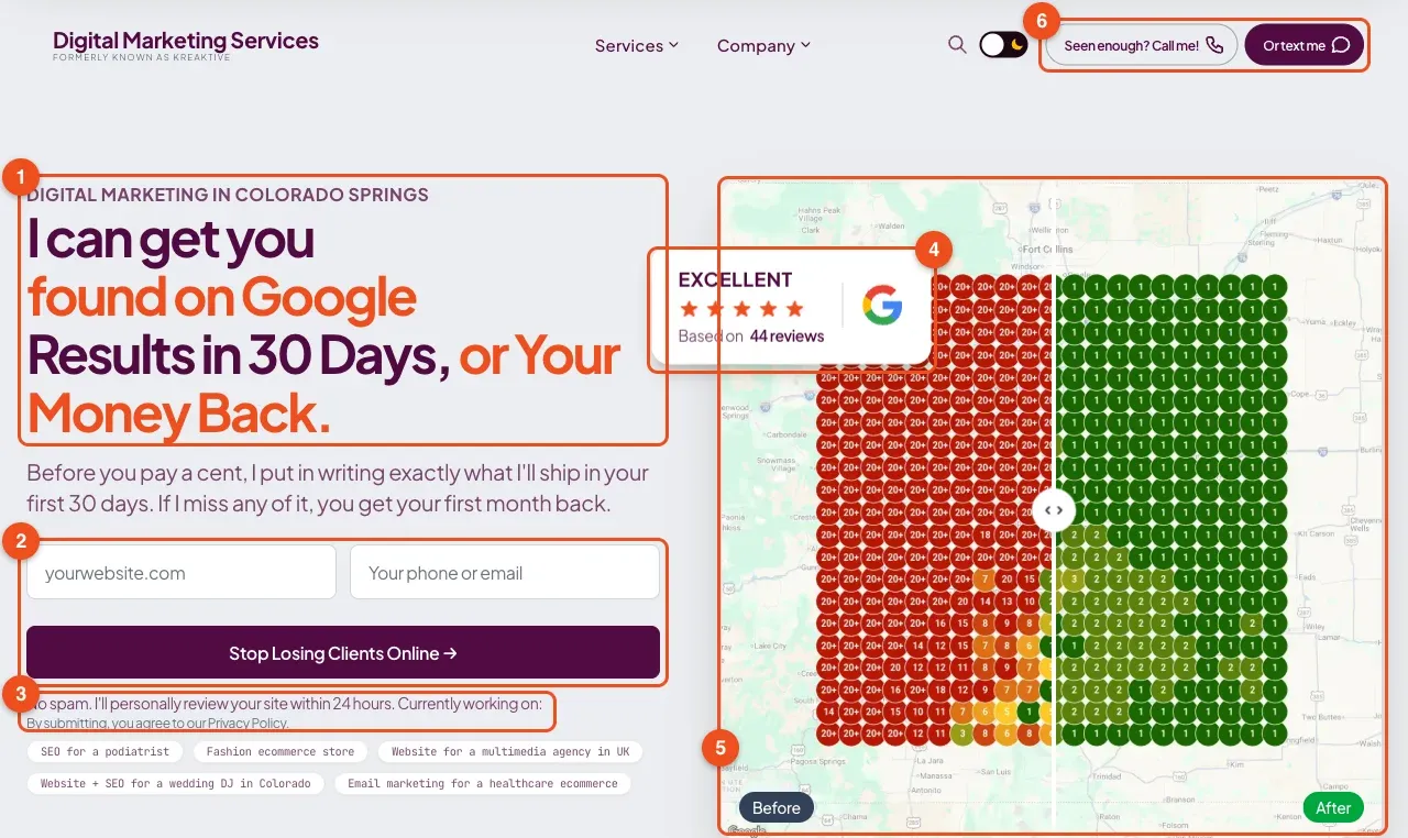
Screenshot taken October 3, 2026.
1. The headline says what I do in plain words. “I can get you found on Google.”
2. A two-field form, right in the hero. Website and phone or email. That’s all I need to review a site and get back to someone. The button says what you get (“Stop Losing Clients Online”), not “Submit.”
3. Reassurance under the button. “No spam. I’ll personally review your site within 24 hours.” It handles the two biggest fears before anyone has to ask.
4. Social proof inside the first screen. The Google review badge sits next to the headline, not on a separate reviews page.
5. Visual proof instead of decoration. The image isn’t a stock photo. It’s a before and after ranking map you can drag, showing what the work actually does.
6. Call and text are always one tap away. The header buttons stay visible as you scroll, so anyone who’s convinced halfway down can act right then.
Right below the hero comes the strongest proof I have:
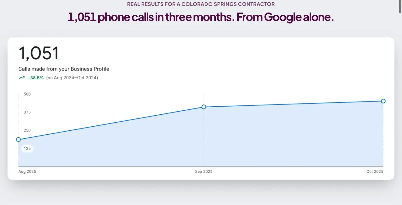
I want to be straight about what that number is. Those 1,051 calls came to a Colorado Springs contractor through their Google Business Profile, not through a website form. I put it directly under the hero anyway, because the person reading my homepage cares about exactly one thing: will this guy make my phone ring? This proof answers that question at the moment they’re asking it.
The rest of the page follows the Step 3 flow: a “sound familiar?” problem section, what I do about it, more proof, an FAQ that takes on objections like “your prices are higher than some I’ve seen,” and a final call to action.
What this looks like on client sites
The same ideas, on three very different businesses.
Sealwise Epoxy, Colorado Springs. A trade business with 15+ years of quality work and no online presence after a forced name change. I built the Sealwise website so every element had a job: project photos up front, call, text, or quote request on every page, mobile-first layout, and trust signals like their BBB accreditation and real reviews. The website was one part of a bigger job that also included a new brand identity, local SEO, and social media, so the results below belong to all of it, not the design alone. Two months after launch, their inbox showed nine qualified leads in 10 days. Within 60 days of the site going live, the leads coming in had turned into $26,240 in new projects, and they were fully booked through Spring 2025.
Younger Me MD, Conshohocken, PA. A regenerative medicine practice whose old site had a generic contact form buried at the bottom of the page and broke on mobile. Working with eSEO Space, we rebuilt it with multiple conversion paths: a quick form for people ready to book, a newsletter for people still researching, and a chatbot that qualifies leads. Booking takes three taps on a phone. More detail is in the Younger Me MD redesign case study.
Tycoon Games, New Hampshire. An online board game store where 61% of revenue comes from mobile. Because the Tycoon Games site was designed mobile-first, its mobile conversion rate sits within 3% of desktop.
Three industries, one rule: decide what the visitor should do, then make it easy.
A 10-minute conversion check you can do today
Open your homepage on your phone and go through this list honestly.
- Can a stranger tell what you do, who it’s for, and why you in five seconds?
- Is there one obvious button, and does it say what happens next?
- Can you call or text with one tap?
- Does your form ask for more than name, contact, and what they need?
- Is there a real review or result on the first screen?
- Are the photos of your actual team and work?
- Does the page load in under 3 seconds on mobile data?
- Is there a call to action after your proof section, not just at the top?
- Does your thank-you page say what happens next?
If you answered “no” to three or more, your design is costing you leads. Start with Step 1: give each page one job. For the bigger picture on platforms, budgets, and hiring, my small business web design guide covers what actually matters, and the website cost breakdown shows what a site like this should cost.
Your website should be your best salesperson
A conversion-focused website works the way your best salesperson does. It knows who it’s talking to, gets to the point, shows proof, and asks for the next step.
If yours isn’t pulling its weight, let’s talk. 30 minutes, no pitch, just an honest look at what’s stopping visitors from calling you. Book a call with me, or see how I approach website design for small businesses.
Frequently Asked Questions
It's building every page around one action you want visitors to take, like calling, booking, or requesting a quote, and removing anything that gets in the way. It covers what goes on the page, in what order, and how easy it is to act. It starts before launch, unlike conversion rate optimization (CRO), which tests changes on an existing site.
Usually one of five things: the page has no single clear job, the headline doesn't say what you do or why you, the form asks for too much, there's no proof near the decision, or the site is slow on phones. Check your homepage on your phone against those five before spending money on more traffic.
For most local service businesses, three: name, phone or email, and what they need. Ask budget and timeline questions on the call instead. CXL's review of form tests shows the number of fields isn't the only factor: which fields you ask for matters too. Cut any field that doesn't help you call the person back.
Unbounce's analysis of 41,000 landing pages found a median conversion rate of 6.6%. That's for dedicated landing pages, and it varies a lot by industry and traffic source. The more useful benchmark is your own site: track calls and form fills each month and work on improving that number.
They overlap heavily. Lead generation website design is conversion-focused design where the conversion is a lead: a call, text, form fill, or booking. For service businesses, they're effectively the same thing. For online stores, the conversion is usually a purchase instead.
Sources & References (8)
- Nielsen Norman Group: How Long Do Users Stay on Web Pages?
- Nielsen Norman Group: Scrolling and Attention
- Nielsen Norman Group: F-Shaped Pattern of Reading on the Web
- Nielsen Norman Group: Photos as Web Content
- Spiegel Research Center: How Online Reviews Influence Sales
- Think with Google: Page Load Time Statistics
- CXL: Should You Really Reduce Form Fields?
- Unbounce: Conversion Benchmark Report